


What’s up with all this hate?
Knack is one of the many release titles for the PlayStation 4. It features a little, bronzed robot named Knack who is able to grow and expand his shape and size using artifacts.
Since the game’s appearance at this year’s Electronics Entertainment Expo all I’ve heard about the game is how bad it is and the poor design of it’s mechanical mascot.
How can a guy that cute be poorly designed?
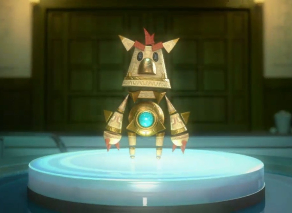
Sitting alongside many other console launch mascots, I’ll admit Knack is in dubious company, but his design is far from being uniformed or bad. As Knack gains more artifacts he grows moving from his smallest state to the size of a small building with a mane of spikes lining his body.
He changes size, shape, form, and element using his artifacts to change his look.
The little guy’s appearance is meant to deceive and present him as a childlike device to hide its powerful potential. So why do we hate Knack and love Sackboy? Maybe it’s because on the official Facebook page they called Knack the next generation Crash Bandicoot?
Wait, he looks a hell of a lot like Crash… Well Mark Cerny is working on the game and he’s the creator of characters like Spyro, Jak and Daxter, and he worked on Ratchet and Clank.
But compared to other characters like Bubsey or Cool Spot who clearly were made with 90’s sensibilities, Knack looks like he was designed with the next generation of games in mind. Just look at the textures on his model and the personality in his simple expression.
But are mascots still relevant?
I think that’s the burning question for critics of his appearance. While he’s on a grown up console, who is he meant to appeal to?
Mascots represent a time in gaming when things were quite different and nebulous in their appeal, but things are quite different in 2013. We have system selling characters who are great because of his or her writing rather than appearance alone. So why do we keep seeing mascots when we care more about depth than aesthetics?
Here’s a short list of some other mascots and the designs that made them iconic or sardonic…I just needed a word that rhymed.
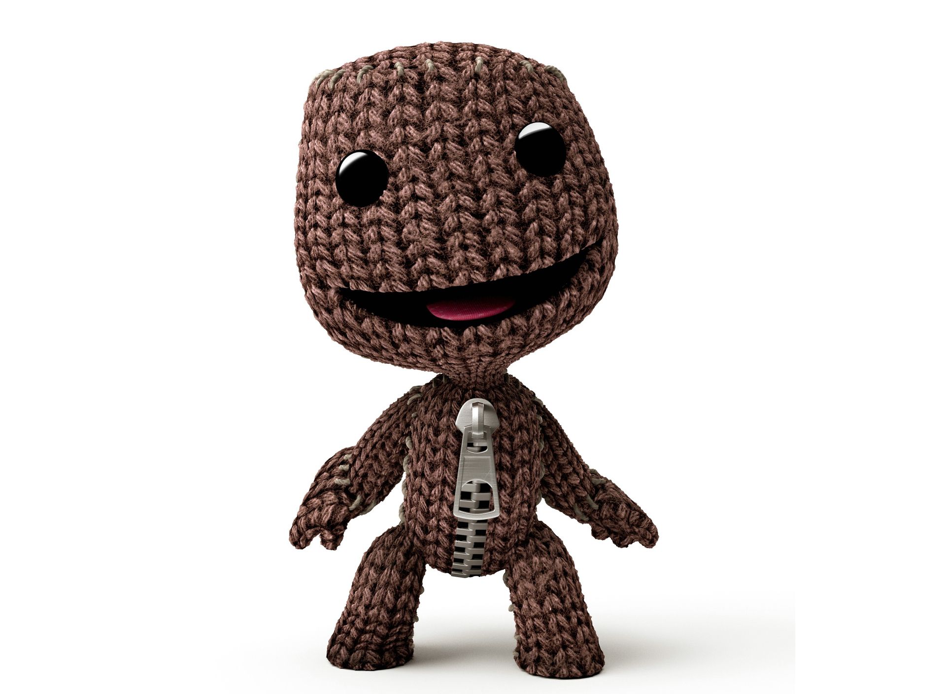
Sackboy, PlayStation 3
As the unofficial mascot of the PlayStation 3, Sackboy from Little Big Planet is designed to be fun, playful, and childish. Its patchwork design reflects the quilted look of the game’s world and the way players stitch together their worlds.
Sackboy is just filled with whimsy, but on the inside it’s just fluff. There’s no personality beyond the four or so emotions given to the little guy. As a mascot, Sackboy represents the fun of creation and joy of competitive destruction. The meaning in the design doesn’t go beyond that… but Sackboy was immensely popular possibly due to this blank slate design.
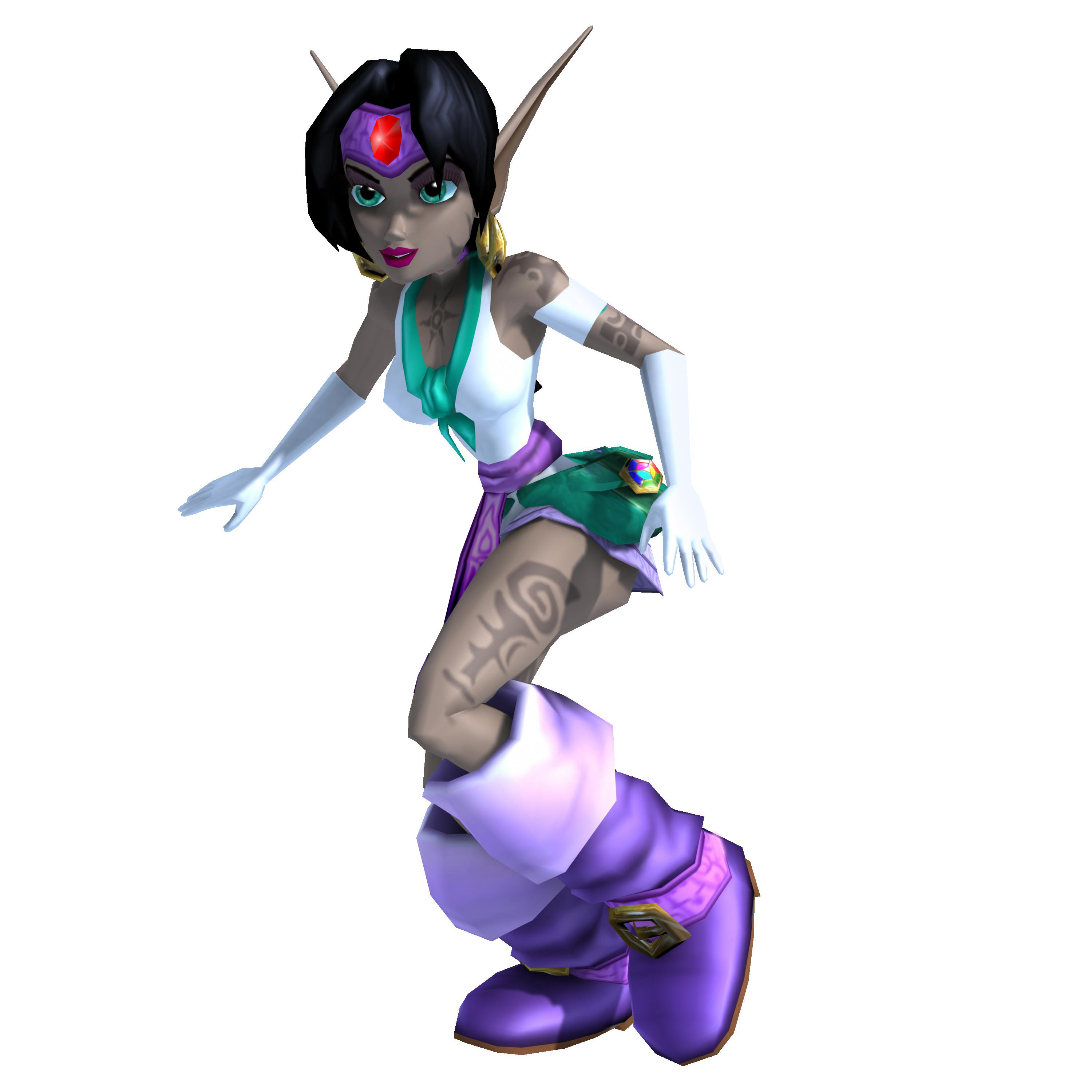
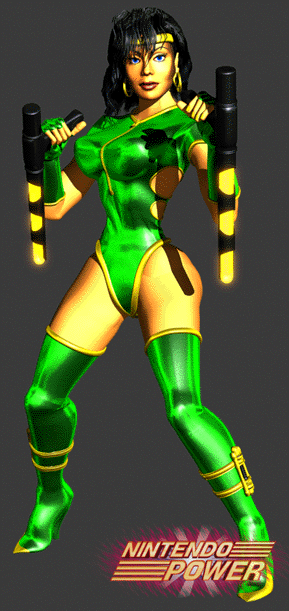
Kameo, Xbox 360
A mixture between a fairy and a rather weird caricature of Native American dress, Rare’s heroine in Kameo: Elements of Power is the forgotten mascot of the Xbox 360 launch. What does her character design really tell you about who she is? Well, her design doesn’t tell you much.
It’s important to note that Rare’s George Andreas worked on the project and she bears quite a resemblance to Black Orchid from Killer Instinct. Even with that in mind, Kameo has a personality of her own, but she’s ultimately forgettable. Her design is cartoonish and playful, but it’s not system defining or interesting enough to be memorable.
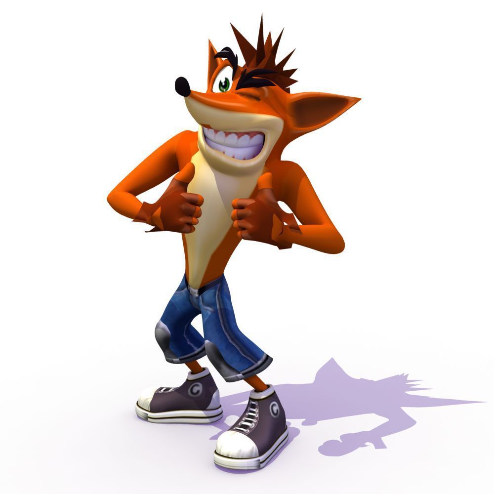
Crash Bandicoot, PlayStation
Crash is an insane bandicoot, which is a kind of marsupial. Looking slightly deranged with two different sized eyes, he was the official mascot of the PlayStation when it first arrived in the West. He’s a far cry from where Naughty Dog is now, but he’s still iconic if for all the wrong reasons.
The orange colour, the expression on his face, the… shoes. Well, he isn’t that bad, but you can see why someone like Crash might not hold up in today’s market. He’s a spectre of the late 90’s and of the early 2000’s. He represented the wild side of the console, though the more sensible characters of the other console still held a stronger appeal than him.
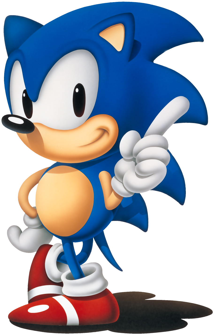
Sonic, Sega Genesis
Well… honestly one of the most iconic designs in all of video games, Sonic (the proper one) was the definition of speed. He flew in the face of Mario in both colour and design with bold spikes and a leering expression that’s said in a demonic whisper, “Gotta go fast…”
In all seriousness, Sonic’s design is memorable because of how vastly different he was from Mario. Without the great console war of the 90’s, Sonic may have faded like other Sega icons like Alex Kidd. He’s a great character who has fallen on hard times and his redesign wasn’t able to keep up with the times.
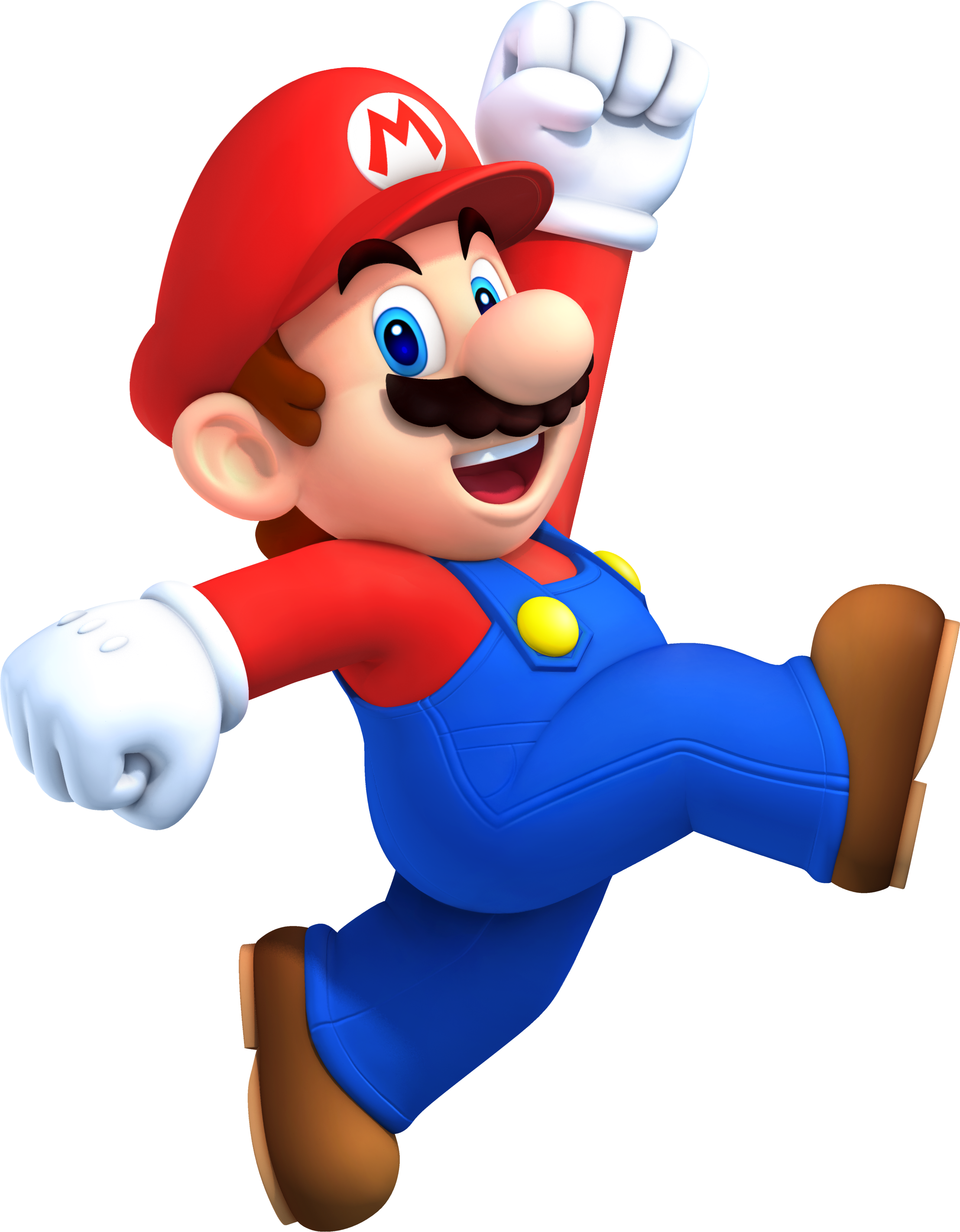
Mario, Nintendo Systems
Mario is known around the world. He is and will always be the face of video gaming no matter what size or shape he appears in. He’s an icon for Nintendo and the medium itself, but as a plumber dressed in overalls and a cap he’s certainly come a long way since his NES days.
Over the years dressed in different costumes, Mario has maintained an image as the mascot of each successive Nintendo console. His design has evolved over the years and he represents a kind of stability in branding seen throughout Nintendo’s first party titles. Find an image and stick with it that seems to be the Nintendo strategy.
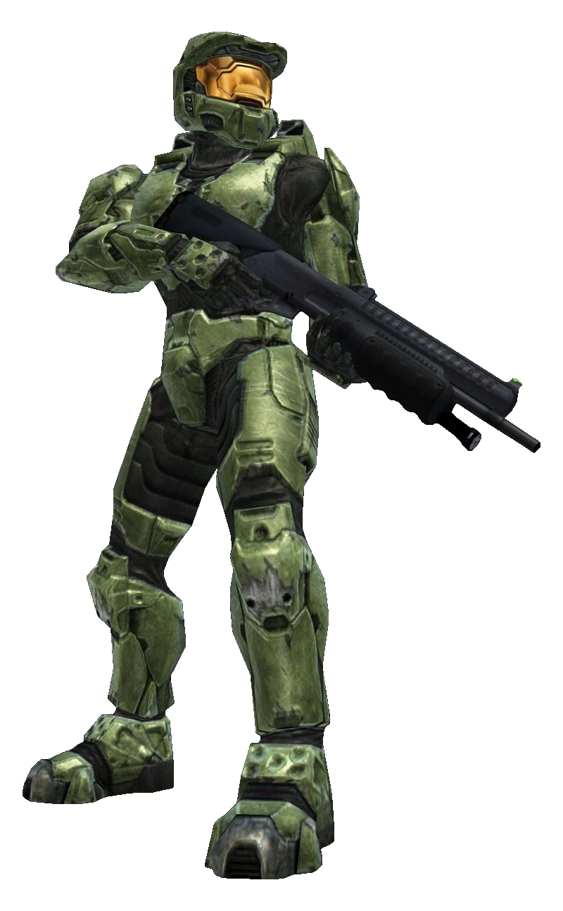
Master Chief, Microsoft Xbox
The word Spartan is synonymous with the Xbox and Halo. With his green armour and amber visor, Master Chief was the face, or lack thereof, of the Xbox. He’s iconic in his design, but what does his armour really tell you about his character?
Without Cortana and the work of filmmaker Neill Blomkamp, would the Chief be as iconic? It’s like any other character on this list, he or she always has a number one or number two that backs up his or her character. On his own, Master Chief is designed as a futuristic soldier, but only after years of work and image consulting had he become truly iconic for his look.

Terry Bogard, SNK Playmore
Terry is a bit of a joke entry into this list, but he has consistently been the face of SNK Playmore. He’s humanoid and wears a red vest extremely reminiscent if the 90’s. He hasn’t changed over the years, so that’s all I have to say about him. That’s a nice hat.
***
Knack is in competition against characters like the ones above. It’s a tough cast and crew, but with an inventive design he could become the icon of the PS4.
The odds are against him and personally I doubt – though I hope – he’ll be remembered. While his outside appearance is important so too is the writing for his character, his number one and two, and the overall experience with the game.
If Sony was really relying on him to carry the system he’d already be appearing on bus stops around major cities everywhere. As it stands, he’s not, but that doesn’t mean he’s poorly designed. It just means the iconic video game characters paradigm is shifting.
We’ve all grown up with video games with mascots at the helm, but now there’s a general sense that there’s no place for childishness now. Internet forum-goers want to see serious games and serious icons from our new consoles.
Knack represents one of the first offerings in the new generation of consoles. If anything he might be remembered for how much everyone hated and the loved him.

So… Knack is pretty much a humanoid Katamari? My biggest problem with Knack as a mascot is that his look really isn’t well defined. Design-wise, you’ve got all these random floating metallic pieces with runes on them (or something) with a goofy looking head. And then depending on which artifacts he gains, his look changes dramatically.
Nintendo does well with its mascots because they’re given iconic design features that are simple and not driven by what’s currently popular. Whenever they release a new Zelda game with a new artistic direction, you still know it’s Link because of his clothing, the sword and shield.
Knack? Umm… he’s a gold robot with red hair and floaty bits.
It’s a good point about Nintendo’s mascots. Over the years and even though their designs have barely changed, Mario, Link, Samus, Yoshi, Fox, and others have maintained their posts as recognizable faces in gaming.
Knack was designed to be this generations’s Crash Bandicoot and he even looks similar, but I think he comes from a specific strain of character design. More cartoonish and kiddish than Nintendo’s iconic mascots.
Crash like many other characters in the 90’s failed to keep up because they lacked that defining and nebulous quality characters like Mario and Link have, and sadly that might be the fate of Knack.